Making an entrance
It has become essential, in recent years, for traditional art institutions to undertake a ‘makeover’, writes Jeremy Melvin. Simply displaying fine work or putting on performances is not enough in an era of cultural relativity, when few people will stick their heads above the parapet and declare, as did the late Kenneth Clark (the youngest ever director of London’s National Gallery), what is great, what is wheat and what is chaff.
The British Museum is doing it via a competition recently won by Lina Ghotmeh; this newsletter recently covered the successful reworking of the National Portrait Gallery by Jamie Fobert; the Wallace Collection is about to announce an architect; and the Barbican is reworking yet another of its space, this time using Allies & Morrison and Asif Khan.
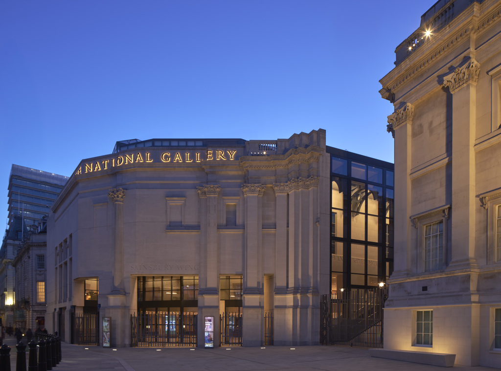
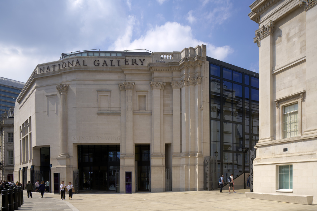
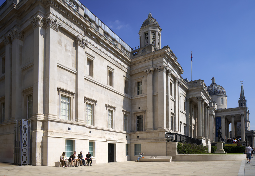
The latest completed work concerns the National Gallery in Trafalgar Square, currently celebrating its 200th anniversary. It has just revealed its rehang both in the original William Wilkins building and its Sainsbury Wing, and the redesign of the entrance to the latter, so that it properly fulfils its additional role as the main entrance to the whole NG. The architect is by Annabelle Selldorf, with support on conservation and delivery from Purcell.
The Sainsbury Wing, and its site on the square’s north-western corner, has a long and controversial history. Long vacant, Mrs Thatcher and Michael Heseltine thought they could unleash the power of capitalism to pay for much needed expansion space for the National Gallery. The new building, to be selected by competition, would include plenty of commercial space and a relatively small gallery.
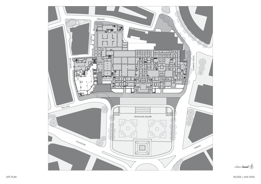
Site plan showing Sainsbury wing (adjoining Whitcomb Street) in relation to the main gallery and Trafalgar Square
Many people thought Richard Rogers’ proposal stole the show, proposing a new pedestrian link between Leicester and Trafalgar Squares, which has in fact now been achieved. But it was Ahrends Burton & Koralek who won the competition with a subtle and discreet design which nonetheless drew opprobrium from many quarters, including the then Prince of Wales, who referred to the design as a ‘monstrous carbuncle’ on the face of a much-loved friend. The proposal was dropped. A second competition included a roll-call of then fashionable architects: Dixon Jones, CZWG, Colquhoun and Miller and Stirling Wilford. Venturi and Scott Brown won, it is rumoured, because they were the only competitors who could speak knowledgeably about the collection of Renaissance paintings which it was to house.
And it is a magnificent collection with paintings by Piero della Francesca, Uccello, Giotto as well as Botticelli, Leonardo and Titian. Some of its works were among the original acquisitions, from the initial gift of George Beaumont or the collection amassed by the financier Julius Angerstein, eventually purchased by the government with the unexpected windfall of a war debt repayment by Austria.
The gallery grew through private donations from the Angerstein purchase and the Beaumont gift, spurring the government to commission a building on the new Trafalgar Square, after two temporary homes on Pall Mall. The task went to William Wilkins, classical scholar at Cambridge and son of a successful ‘monumental mason’ in Norwich. Given this background he had only one career option, that of an architect. His worked naturally encompassed classicism: he is best known for UCL and Downing College Cambridge (a sort of half-hearted tribute to Jefferson’s University of Virginia) as well as the National Gallery, but reputedly his favourite work was the charming, ‘Gothick’ New Court at Corpus Christi College, Cambridge. Though lacking the flair and talent of the older John Soane or the occasionally clumsy muscularity of his near contemporary Robert Smirke, he was competent and the gallery spaces he designed are fine. Venturi and Scott Brown successfully picked up on the enfilade of spaces he designed to extend an axis through their gallery which forms an armature for a series of cross axes.
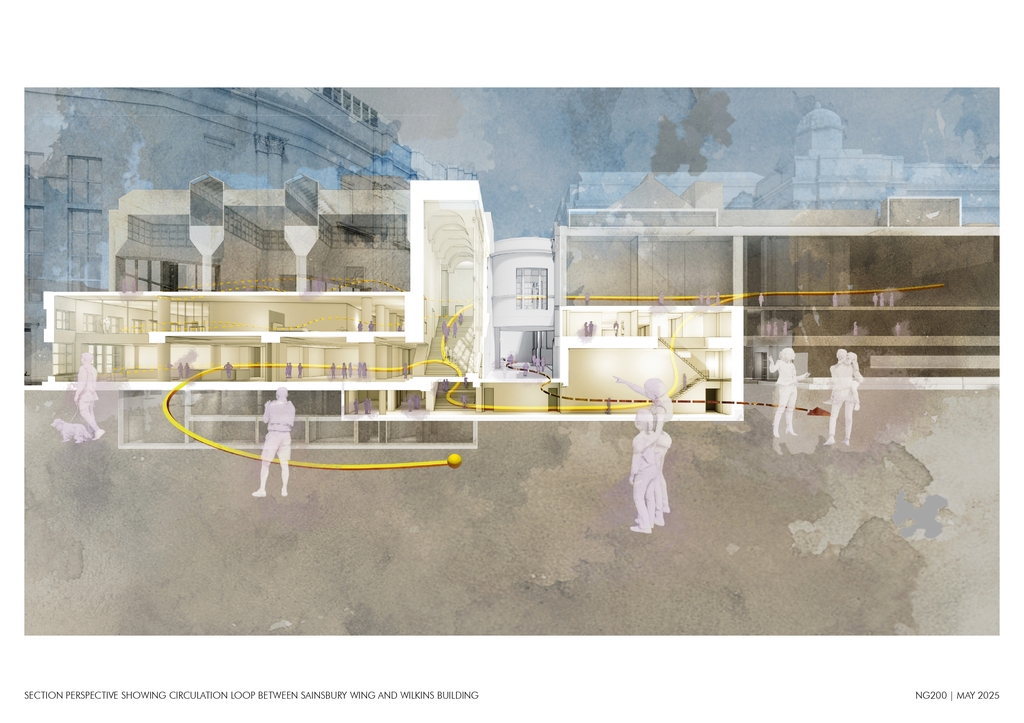
Section through gallery, Sainsbury wing to the left, main gallery to the right link (in elevation) between them
Their design made a series of good galleries, all on the highest floor so enjoying top light which, sensibly, Selldorf and the Gallery staff have scarcely altered. Where the building was less successful was on its lower levels, the ground floor entrance and the cramped mezzanine restaurant in particular. It was originally a secondary entrance, the primary being through Wilkins’ portico looking over the square and requiring the ascent of a considerable number of steps. Selldorf’s brief was to improve entrance to the Sainsbury Wing which had become the main entrance for the whole institution because of accessibility difficulties in relation to the original entrance.
The Sainsbury/main entrance is at grade with the pavement outside which makes sense not just as a practical step, but also in exploiting one of the highlights of the VSB design, the magnificent staircase rising from the entrance to the gallery level where it intersects the enfilade created from Wilkins’ building through their own.
Entrance to the Sainsbury wing, now the gallery’s main entrance: note the loose treatment of columns and pilasters. Photo: Edmund Sumner
The square off the main square, making a setting for the entrance to the gallery. Photo: Edmund Sumner
This stair always had an entrance to the lecture theatre at its mid-point. Selldorf has given this more prominence, justly because the theatre is rather a good one. There is also a cloakroom at this level, always necessary in a gallery but often awkward to accommodate.
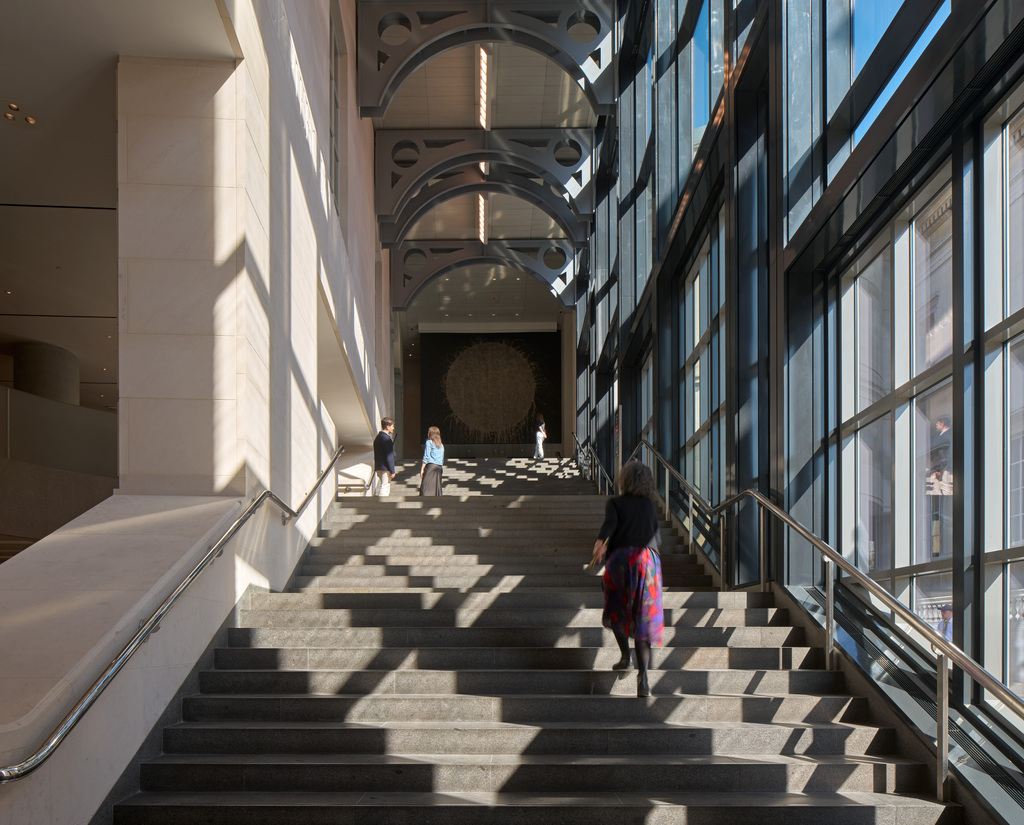
The staircase, one of the original designs highlights, leading to the axis joining the Sainsbury and main galleries. Photo: Edmund Sumner
Selldorf’s most dramatic intervention, though, is to take away a chunk of the mezzanine over the entrance foyer, expanding the rather mealy-mouthed double-height area of the original, to induce a far greater sense of light, space and openness, in keeping with this being the main entrance. It is far easier for visitors to orientate themselves, to see where the shop and information point are, to find the lifts for those unwilling or unable to ascend the stairs. Outside a discreet piece of landscaping by Vogt marks the transition from the square into the gallery, subtly marking the wing’s increased significance. A wall and grassed space attached to the Wilkins building have been removed to increase the arrival area outside the entrance, which also has the effect of reinforcing the visual connection to a walking route through to Leicester Square.
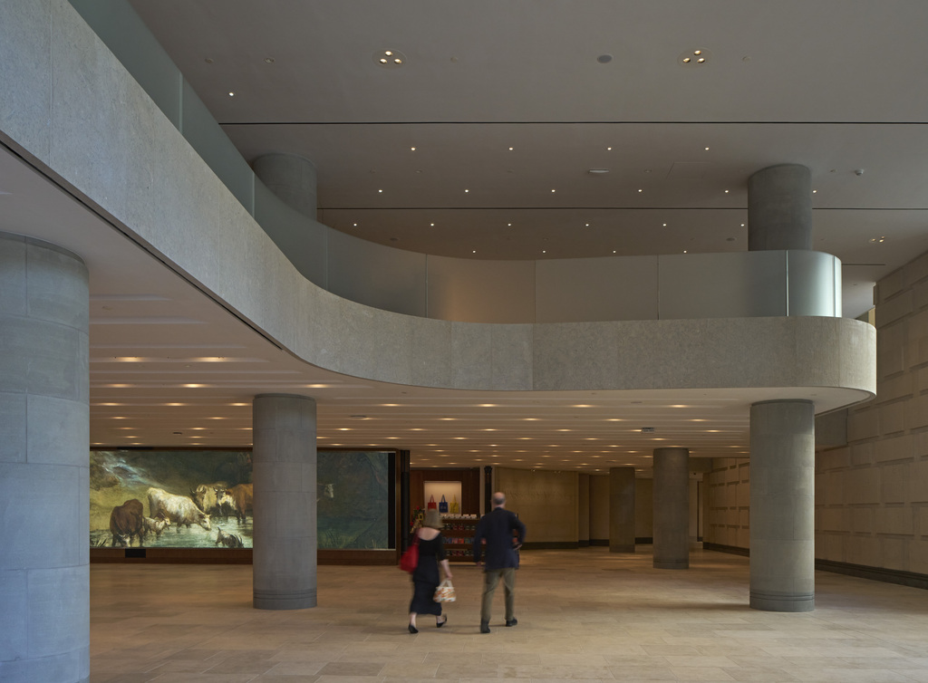
The remodelled foyer with a greatly increased double height space fells more generous and spacious. Photo: Edmund Sumner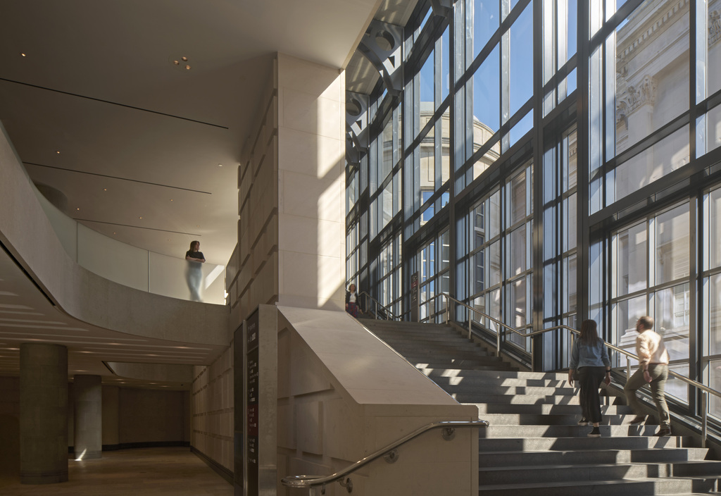
Mezzanine and staircase. Photo: Edmund Sumner
The Roden Education Centre in the Orange Street building is also an important though less dramatic element in the NG 200 programme. The basic building, designed by the government’s Property Services Agency in the 1970s, has many of the outward features of institutional architecture of the time with few of its admittedly scarce redeeming features. Hannah Lawson of Lawson Ward has conjured within this unpromising shell a series of spaces well attuned to school groups, families or adult education. There are drawing studios, classrooms suitable for children with special educational needs, good light, fine details and materials that seem luxurious. It looks well suited to its purpose of forging new and multi-layered links between the public and its national art collection.
Overall, the NG 200 programme seems a credible initiative to capitalise on the quality of the gallery’s collection. Smaller than many of its European equivalents, its quality and range is nonetheless very high. Its architectural standards were less high. Wilkins’ building comes shortly after what is probably London’s best art gallery and possibly one of the best in the world, Soane Dulwich Picture Gallery, and unsurprisingly falls short. He was not helped by the sort of brief which has become typical of British government commissions, which forced him to re-use William Kent’s columns designed for the previous building on the site, the Royal Mews.
As a strict classicist and lacking a tad in the imagination department, this set the height and proportions he would have to use for the gallery façade which may explain why he felt obliged to lighten it somewhat with the rather ridiculous pepper-pot dome, though ‘dome and portico’ was something of his stock in trade as he used it at UCL too. When Venturi came along 150 years later, as a more relaxed classicist, aka post-modernist, he played with the idea of a columns through his sequence of pilasters. And as a post-modernist he incurred the wrath of the British architectural taste makers of the 1990s, rooted as they were in what now seems rather misplaced moralising. The world did not end with post-modernism; bad architecture of any sort was a far greater threat. What Selldorf and NG director Gabriele Finaldi have shown is that subtle alterations and imaginative curation can have a far more beneficial effect than any amount of misdirected morality.
The group of former RIBA presidents who objected to the Selldorf design must be feeling foolish.
Founder Partner


